- Changes to masthead - Dark green of cover 1 is too dark - colour needs to be changed
- I have added a rounded square on my covers. I think this ties the cover together and gives the magazine a more distinctive house style.
- I have created my first contents page and added the box in.
- Cover 2 needs cover lines and a main cover line - I am struggling to find a font that will both suit the genre of the duo and still be legible. I may choose to use a simple, bold font.
- Contents page 2 needs to be created. Once I am finished with Contents 1, I will duplicate it and use it as a template for Contents 2.

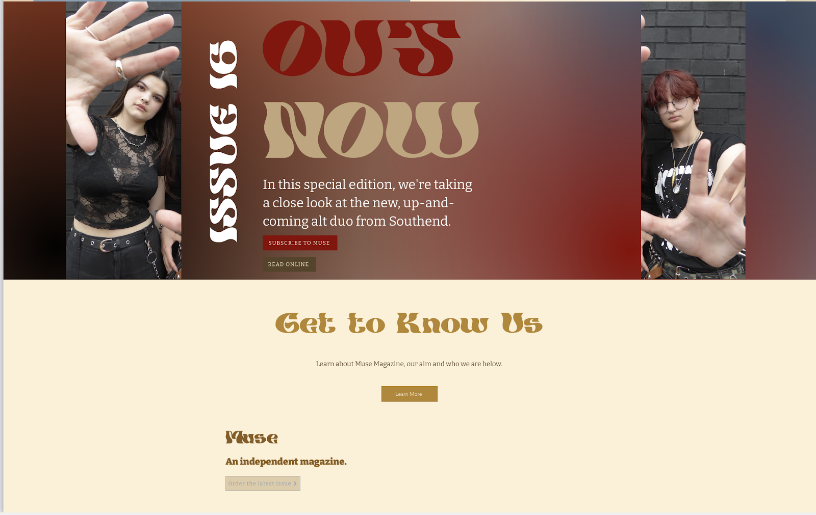
So far, I have continued to add to my home page. After including the bold round rectangle on my cover, I added it to the website in order to create a clear sense of cohesion across print and web.
- I have added a background to the "welcome" section - a photo of multiple magazines layered on top of each other. The magazines are Vogue copies, but this cannot be seen in the image and is therefore not an issue.
- I have added the first easter egg on the website - the guitar seen in the Hunter Scott article section leads to a pop-up about a collaboration between Muse and "Delphine Guitars". Whilst on a trip to Paris, I went to a market which had a music shop inside, so I took photos and used some in this pop-up.
- The rest of the home page is fairly similar - only changes made are the bottom two sections. I have added in that Muse is an independent magazine, as this is part of the brief and could be important to the audience.


No comments:
Post a Comment