Website - https://musezine.wixsite.com/muse


WEBSITE: HOME AND ARTISTS
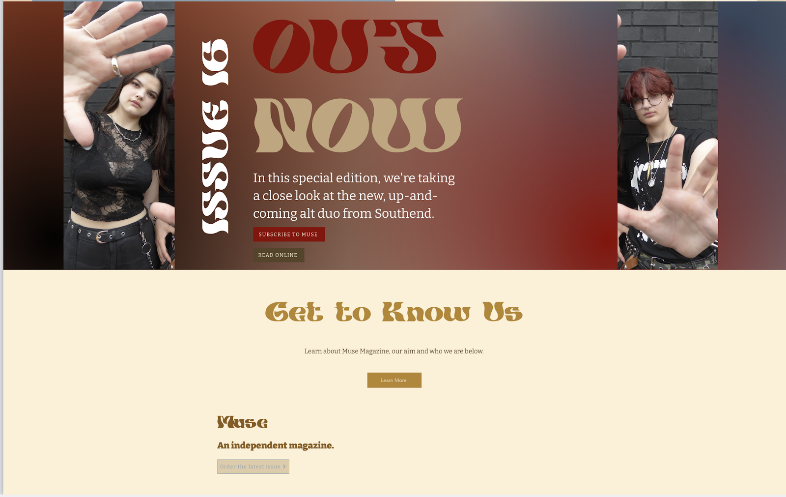
PAGE ONE - HOME
Subscribe pop-up


Easter egg - press the guitar to open the pop-up which shows information about a collaboration between Muse and a shop that sells guitars:

Home page continued:

Easter egg: hover over the beige box for a sneak peek of the poster. Find the secret code in the print edition and enter it into the website for a chance to win a free Eternal Sunshine poster. Eternal Sunshine is intertextual of one of Ariana Grande's recent albums, so avid fans of Grande may recognise this and be more inclined to listen to their music. Less avid fans may still be aware of Grande's album and so may also feel gratified for recognising this intertextual reference.


PAGE TWO - ARTISTS

- "Artist of the Month" sticker twirls around when hovered over
- Open Spotify button links to the Spotify website and is the same colour as the logo, so audiences who use Spotify will be able to easily recognise the colour as being part of the Spotify brand and will also find it easy and practical to quickly open the app/website to pre-save Hunter Scott's album.
- "Which albums inspired Hunter?" button opens a pop up which displays a rotating carousel of country album covers that inspired Hunter Scott. The albums range from more well known artists, like Bruce Springsteen, to lesser-known, more indie artists. This intertextuality will both gratify and intrigue audiences.
- the vinyl sticking out of the album cover spins whilst the page is being scrolled down to make it look like a spinning vinyl going at the same speed at which the audience is scrolling


Easter egg: The shop now button opens the same pop up as the guitar easter egg on the home page. The location of the shop, as seen in the top right corner of the image, shows the shop is based in Paris, France, which implies that despite being a small, independent magazine, Muse has global connections.

Moving feature: the vinyl spins as user scrolls down.

Again, the pop up for "What albums inspired Hunter?" can be opened here by pressing the button.
Video - shows Tall Child, a real artist, performing a snippet of a song. Tall Child is a fairly small artist, with just over 1000 monthly listeners per month. Muse's purpose is to uplift small and up-and-coming artists, so by adding the video and the review, they will hopefully draw the attention of interested audiences.
Video - shows Tall Child, a real artist, performing a snippet of a song. Tall Child is a fairly small artist, with just over 1000 monthly listeners per month. Muse's purpose is to uplift small and up-and-coming artists, so by adding the video and the review, they will hopefully draw the attention of interested audiences.

Footer - includes a button to order the latest issue.