Magazine inspiration
Below shows some magazines/posters I am inspired by.

I like the use of framing and posing here, although I think there could have been higher levels of contrast between the colour of the clothes and the background. A red background, for example, could have helped draw more attention to the clothes and stance of the model and his outfit.
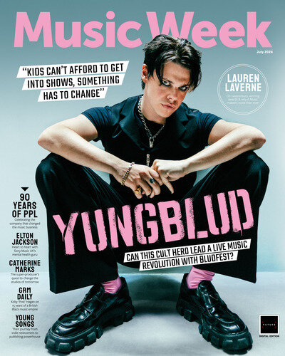
I like how the same colour has been used for the main cover line, masthead and the model's socks as it gives a sense of cohesion and intentionality.

This magazine uses very interesting framing in their covers to create an impactful, memorable and eye-catching look. I will consider how I can use impactful framing within my magazine design and online.


No comments:
Post a Comment